When we are invited by owners of small properties to visit their home for the first time with a view to finding them a buyer, it can be a bit like opening a box of chocolates – you never quite know what you’re going to get.
Sometimes behind the front door of the most unassuming properties everything, from the use of space and light to the choice of colours, works in harmony to create a subtly luxurious home you instantly know will appeal to an array of buyers.
Because the spaces flow so naturally, such properties look like an accident of design but of course, more often than not, a skilled architect has drawn on various techniques to make the most of the space available. Here are just a few top design tips from our colleagues based in Savills Architectural Design.
1. Take time to craft the floorplan Every space needs to work hard in a small area. Open-plan areas can make homes feel larger, but it is still important to have distinctive zones – for example, for eating, cooking, relaxing, working and perhaps a children’s play corner too.
These can be defined by architectural elements such as changes of floor or ceiling levels, glazed partitions or double-sided open bookshelves. Increasing your ceiling height by opening it up to the joists, if possible, will also create the illusion of a larger floor plan.
2. Internal doors Where you do have separate rooms, think about how these are formed. For example, pocket sliding doors will perform that dual function of separating adjacent spaces, yet seamlessly opening them up when appropriate. Going one step further, movable walls also work very well for the right space and there is an abundance of clever systems on the market to consider.
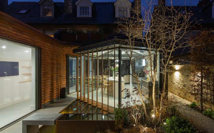
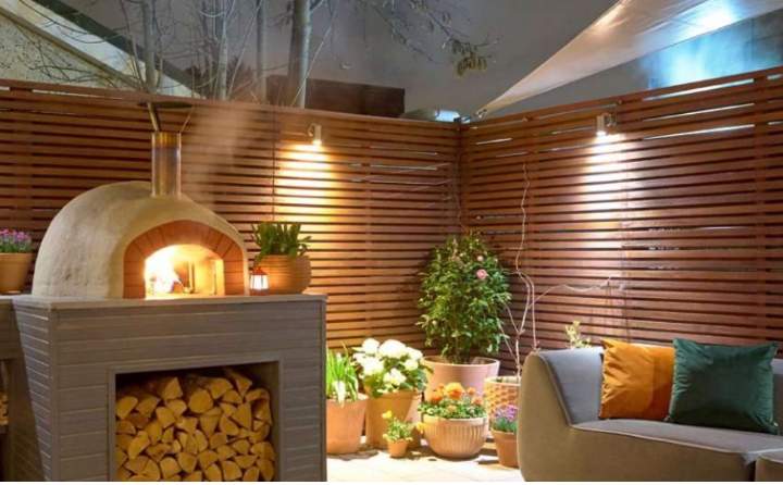
3. Connection with the outdoors Large glazed external doors will make your home feel more spacious by blurring those lines between inside and out. Patios, balconies and terraces can then become an extension to the living and dining area, and with the right garden heating and over-head cover outdoor areas can be used all year round.
When looking at glazing styles, the first consideration is whether contemporary or traditional is right for the property, before looking at details such as timber or metal doors and hinged, sliding or bifold options.
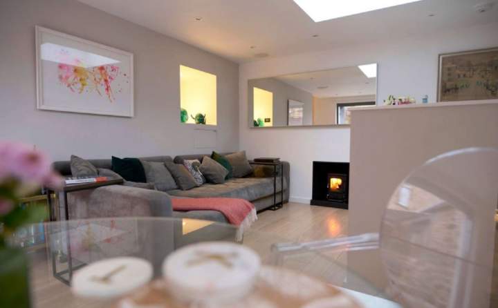
4. Natural light The lighter the space, the larger it will feel and while there are a multitude of clever artificial lighting options on the market, natural light is always more effective. So think about replacing solid doors with glass panes to allow light to flow throughout the property, or high-level slot windows in order to keep the wall space below free for placing furniture.
Also consider skylights, pop-up roofs and lightwells, and when creating basement levels, glazed ceiling/flooring systems that you can walk on will funnel light in from the rooms above.
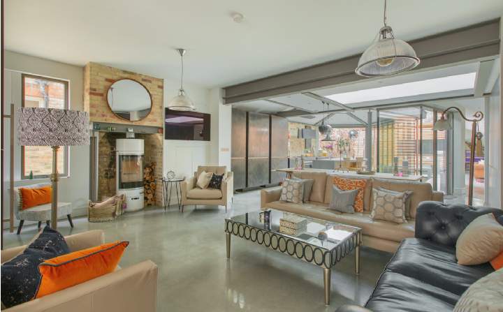
5. Interior design is key Use of light colours, glossy surfaces and large mirrors help to bounce the light. Pattern, layering and texture are also important in adding depth to small spaces, again helping to create zones in open plan areas.
6. Less is more The famous quote by 19th-century designer William Morris – 'Have nothing in your houses that you do not know to be useful, or believe to be beautiful' – is even more apt when it comes to small homes. It is important to make decisions about what belongings you really need to tidy away and what you want to keep on show. Make the most of every nook where discreet cupboards and shelves can be created.
7. Chose the right furniture If you keep the walls light, then this is the place to add splashes of colour. Size of individual pieces is key; large, heavy items will make the space feel smaller and this rule applies to kitchens and bathrooms too – people often cram in unnecessarily large sinks and basins, making spaces instantly more cramped. Choose furniture with a dual function: think dining banquette seating with storage beneath, bed nooks with cupboards above, below, and to either end, ottoman seating and coffee tables with spaces within.
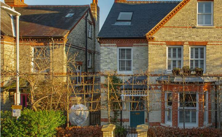
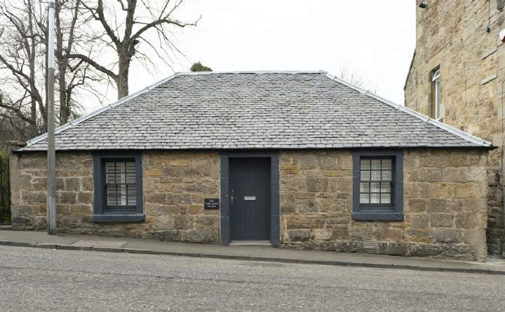
These three properties currently on the market are perfect examples of how effective such techniques can be.
.jpg)
(1).jpg)
.jpg)
.jpg)

(2).jpg)
.jpg)
.jpg)

.jpg)
.jpg)