
(1).jpg "UK Map")
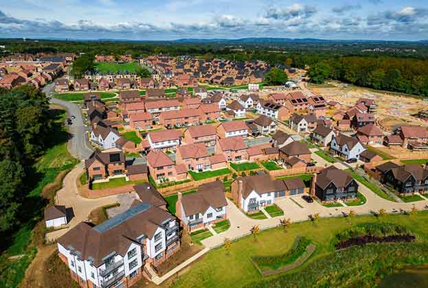
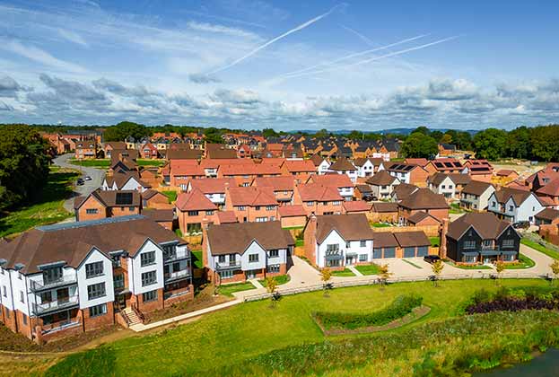
By looking at how house prices have performed in each local authority in England and Wales over the last 20 years, the latest Savills research identifies the specific areas with more capacity for price growth over the short to medium term.
Topping the chart are the ‘Stars' – areas that have consistently performed strongly, irrespective of the housing cycle. Hackney has left almost every other market behind with a staggering growth of 939 per cent, whilst Brighton’s growth pattern is not dissimilar to that of an improving London borough.
The market ‘leaders’ are, unsurprisingly, headed predominantly by prime London boroughs, followed by commuter towns such as Elmbridge, St Albans and Windsor & Maidenhead. What is striking is the extent to which growth in the London leaders has exceeded that for the regional leaders over the past 10 years, stretching the elastic between prime market house prices within and outside the capital.
The analysis suggests that there is potentially more capacity for price growth in the next group down – the ‘next 10%’ - which appears to be the strongest performing part of the market currently. Here, the list is heavily dominated by markets in the commuter zone, such as Winchester and Tunbridge Wells, together with a few outer London suburban boroughs. This reflects the changing nature of the market, where we increasingly see buyers look further out of London to locations that offer more space for their money and good transport links.
At the other end of the scale you have the laggers; those markets that have struggled to perform even when other lagging markets did well, and those which are the last to feel the ripple effect. Notably, many have failed to deliver any net price growth in the past ten year years, underscoring the divergent nature of the UK housing market more generally.
(2).jpg)
.jpg)
.jpg)
.jpg)
.jpg)